E - Portfolio - Project 3
Project 1
31/03/22 - 21/03/22 (Week 1 - 4)
Digital Photography and Imaging (GCD61204)
Class 01 Sec 03
Jeslyn Lim Suharja (0346928)
1.0 Project: The Physical Collage


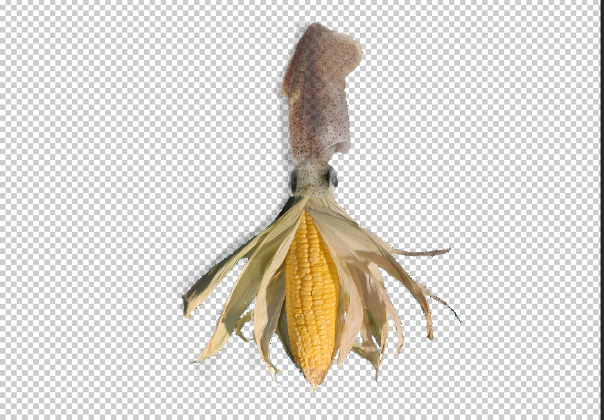
Fig 1.3 Final Chosen Collage

2.0 Project: The Digital Collage


21/04/22 - 26/05/22 (Week 4 - 9)
Digital Photography and Imaging (GCD61204)
Class 01 Sec 03
Jeslyn Lim Suharja (0346928)
1.0 Project 2A: The Double Exposure
1.1 Exercise 1:

Fig 1.1.1 Step 1 (Masking)

In this phase, I added the trees, positioned them, and removed the unwanted characteristics with the brush tool (hair, etc.). Then I applied the solid color layer and matched the color to the grey background from the tree image.


Fig 1.3.4 Final Outcome
2.1 Project 2B: Hearst Mansion
2.1.1 Exercise 1:

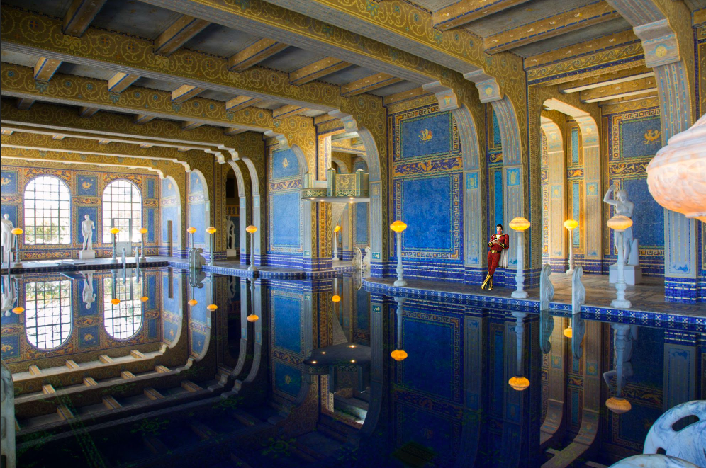


Fig 2.1.1.4 Fourth Step (Final Outcome)
2.1.2 Exercise 2:


2.2 Project 2B: Recoloring Black and White
2.2.1 Exercise 1:


2.2.2 Exercise 2:


Fig 2.2.2.2 Step 1 (Skin Color)


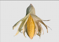
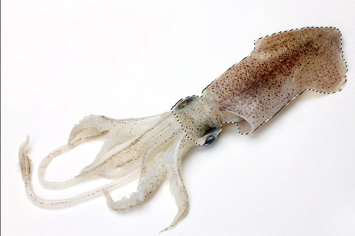
3.0 Project 2C: Photomanipulation
3.1 Mood Board/Visual Research

Fig 3.1.1

Fig 3.1.2

Fig 3.1.3


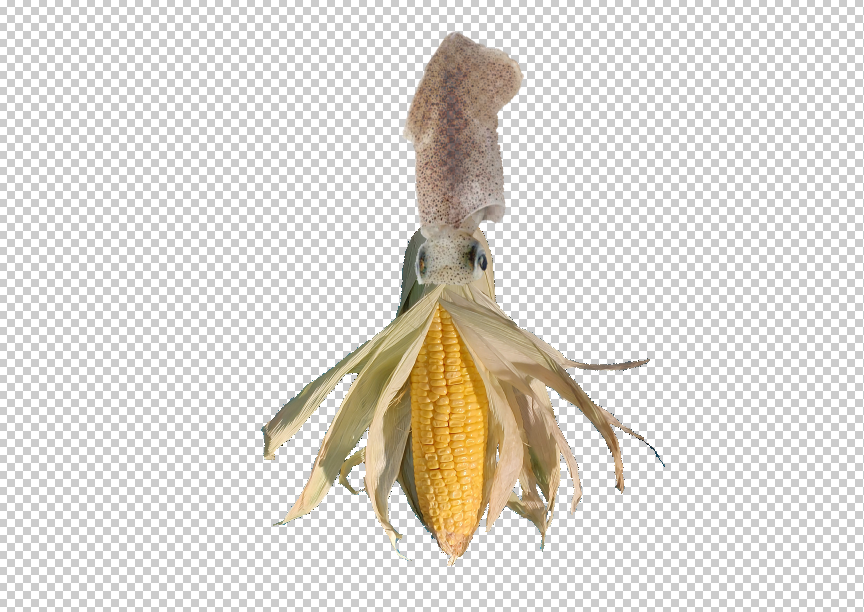


Final Project (4)
31/05/22 - 07/07/22 (Week 10 - 15)
Digital Photography and Imaging (GCD61204)
Class 01 Sec 03
Jeslyn Lim Suharja (0346928)
4.1 Idea Exploration/Development
4.1.1. Write a biography about yourself
INTRO | Tell us about yourself My name’s Jeslyn and I’m from Indonesia, I am turning 17 this year. I’m taking Bachelors in International Hospitality Management. I have 2 younger sisters and 5 pet rabbits. |
PARAGRAPH 1 | What is your passion? This question has time and time again troubled me. I am not quite sure of my passion just yet, it could probably because of my young age. But at the moment I like trying out many different things. |
PARAGRAPH 2 | What’s motivate you to achieve your dream? I don’t really have a dream at this moment. |
SUMMARY | How do you want to visualize your dream into an artwork? I guess since I don’t really know my dream I could use that as the main objective |
4.1.2. Write a statement about your work
INTRO | Tell us about your work My work is based on the biography we are asked to do. It represents what I am and what I like. |
PARAGRAPH 1 | What is the concept behind it? I wanted to make something based on the fact that I still don't know and am confused about what my dream is. |
PARAGRAPH 2 | What is the message you want people to understand it? I want people to understand that it's normal to not know what they want, and that what matters is the ongoing self-exploration and learning about oneself. |
SUMMARY | What is your motto/ quote? That’s life, enjoy every moment. |


Comments
Post a Comment